Wireframing Share Export Locations
From Terminal to Toolbar: Wireframing Share Export Locations
As an Outreachy intern working on OpenStack Manila UI, most of my days will be spent in the command line. However, a crucial part of software development is ensuring that features aren’t just functional, but also usable. Recently, I shifted my focus to the UI/UX side of the project: wireframing the interface for several items, including Share Export Locations.
What are Share Export Locations in OpenStack Manila?
Before diving into my wireframing process, let’s quickly clarify what we’re talking about. In OpenStack Manila, a “share” is like a network drive that users can access. Each share has one or more “export locations,” which are the actual network paths through which the share is accessible. For example, a share might be exported via NFS at 192.168.1.1:/my_share. The new feature aims to allow users to associate custom properties (key-value pairs) with these individual export locations, offering greater flexibility and control on the dashboard.
The Challenge: Visualizing Metadata
In OpenStack Manila, a Share is the fundamental resource (like a network drive). To access it, you need an Export Location—the specific network path or IP address.
We are introducing a feature that allows users to assign custom key-value properties to these locations. While this is easy to execute via a CLI command, representing it in a web dashboard requires careful thought. Where do the buttons go? How do we display a list of properties without overwhelming the user?
My Wireframing Workflow
To solve these questions, I followed a three-step design process:
1. Logic Mapping/Understanding the “Why”
I started by identifying the user’s “happy path.” I needed to ensure that a user could navigate from the general Share list down to a specific Export Location, and finally to a management screen for properties, all in as few clicks as possible. This initial phase also included reviewing specifications and discussions with mentors.
2. Rough Sketches and Flow Diagrams
I started with pen and paper – the quickest way to get ideas out. I sketched out basic screen layouts and drew simple flowcharts to visualize how a user would navigate from viewing a share, to its export locations, and then to editing properties for a specific export location. This helped me identify necessary screens and interactions early on.
Here is a sketch that looks like the final design: 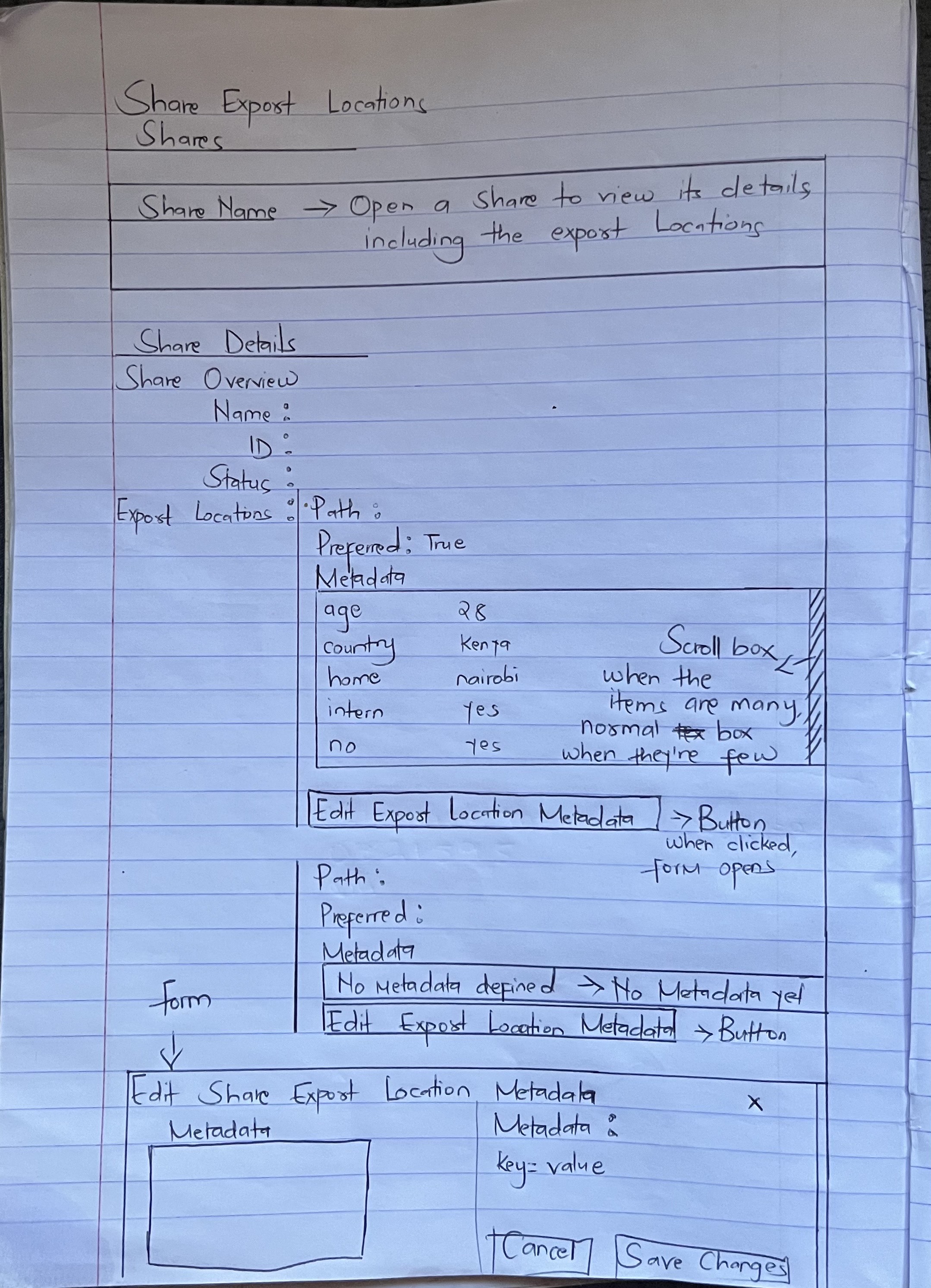
3. Digital Mockups with draw.io. Here is the final design
Once the logic was sound, I moved into draw.io. I built low-fidelity wireframes to define the “bones” of the interface. This included:
-
Property Tables: A clean view of existing keys and values plus the button for editing the metadata.
-
Action Modals: A pop-up window designed specifically for adding or editing properties, ensuring the user stays in context.
-
Empty States: Designing what it looks like when no properties exist yet and also how to minimize a cluttered look if there are many key:value pairs.
4. The Feedback Loop
The most valuable part of wireframing was the review session with my mentor. Seeing the design visually made it much easier to discuss the design and address any concerns before any “real” code was written.
Final Reflections
Wireframing has been an eye-opening part of my Outreachy journey. It taught me that design is a form of documentation. By taking the time to visualize the Share Export Location interface, I’ve created a roadmap for my future coding tasks and ensured a better experience for the end user.
What’s next? Now that the blueprints are finalized, it’s time to head back to the code and start building the frontend!
Wireframes for Other Features I am Implementing
Share Snapshot Metadata
Share Network Subnets Metadata
Resource Locks Panel
Access Rule Locks
Share Deletion Locks
Tip: Don’t be afraid to put down the code and pick up a design tool. It helps you catch “logic bugs” before they ever reach your IDE.